The Complete CSS Flex Tutorial
Learn CSS Visually! Every single CSS property visualized in this pictorial CSS guide book!

⭐⭐⭐⭐ and 1/2⭐ - owned by over 27.1K readers.
Get this CSS book in PDF format, on Amazon or start reading this css book on your Kindle device today!
Much like CSS Grid (my other tutorial) Flex Box is quite complex because it consists of not one but two element types: The container & items.
Please watch this video to support our content network 🙂
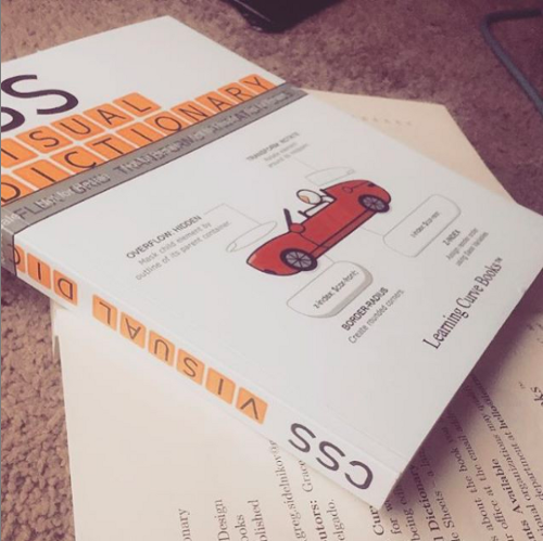
CSS Visual Dictionary PDF (or you can get paperback on amazon) (111 reviews ⭐ 4.5) was the book the diagrams in this tutorial were taken from - this book is a complete classic! featuring a visual diagram for every CSS property in existencelike what you see in this tutorial but for everything.
When I started to learn Flex, I wanted to see everything it was capable of. But, I wasn't able to find a thorough tutorial showing examples of all Flex properties. So, I created these diagrams with Flex from the bird's eye view.
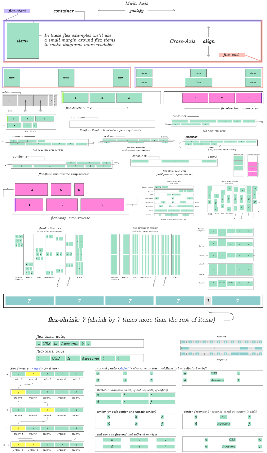
That's everything Flex is capable of. But… let's go over each diagram individually with comments. By the end of this Flex tutorial you should be up to speed with pretty much the complete picture of what it can do.
CSS Flex or Flex Box
Flex is a set of rules for automatically stretching multiple columns and rows of content across parent container.
display:flex
Unlike many other CSS properties, in Flex you have a main container and items nested within it. Some CSS flex properties are used only on the parent. Others only on the items.
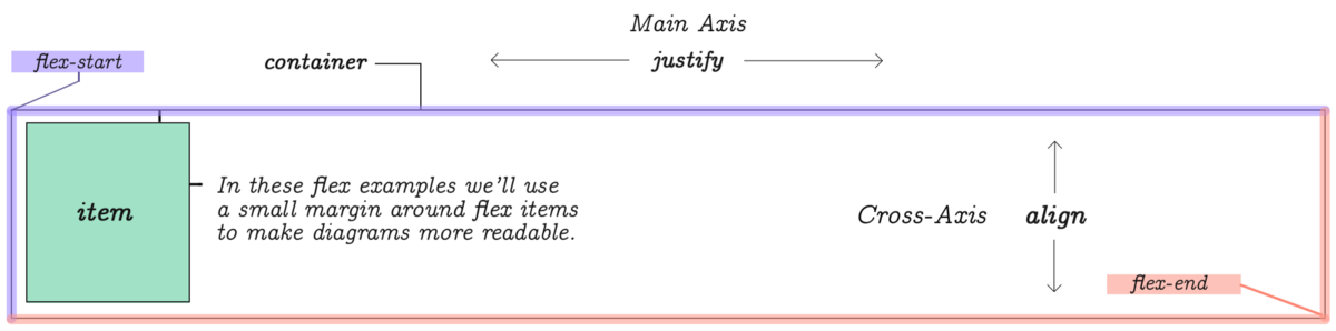
You can think of a flex element as a parent container with display:flex. Elements placed inside this container are called items. Each container has a flex-start and flex-end points as shown on this diagram.
Main-axis and Cross-axis
While the list of items is provided in a linear way, Flex requires you to be
mindful of rows and columns. For this reason, it has two coordinate axis. The
horizontal axis is referred to as Main-Axis and the vertical is the Cross-Axis.To control the behavior of content's width and gaps between that stretch
horizontally across the Main-Axis you will use justify properties. To control
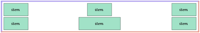
vertical behavior of items you will use align properties.If you have 3 columns and 6 items, a second row will be automatically created by Flex to accommodate for the remaining items.
If you have more than 6 items listed, even more rows will be created.
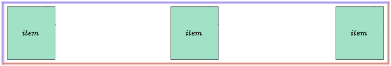
Flex items equally distributed on the Main-Axis. This is the default view. We'll take a look at the properties and values to accomplish this in just a moment.
You can determine the number of columns.
How the rows and columns are distributed inside the parent element is determined by CSS Flex properties flex-direction, flex-wrap and a few others that will be demonstrated throughout the rest of this flex tutorial.
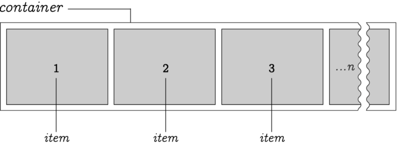
Here we have an arbitrary n-number of items positioned within a container. By default, items stretch from left to right. However, the origin point can be reversed.
Direction
It's possible to set direction of the item's flow by reversing it.
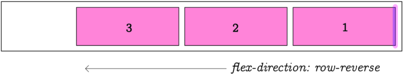
flex-direction:row-reverse changes direction of the item list flow. The default is row, which means flowing from left to right, as you would expect!
Wrap
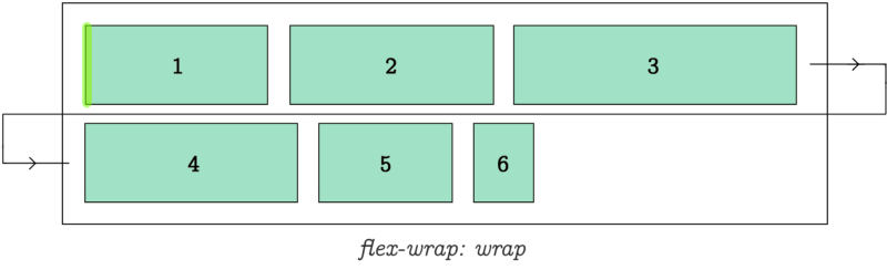
flex-wrap:wrap determines how items are wrapped when parent container runs out of space.
Flow
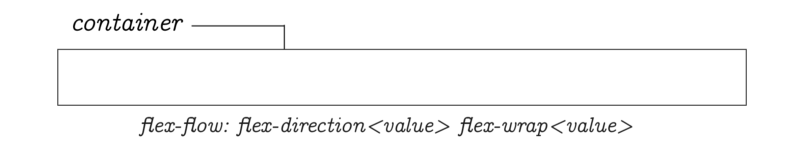
flex-flow is a short hand for flex-direction and flex-wrap allowing you to specify both of them using just one property name.
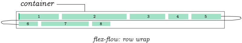
flex-flow:row wrap determines flex-direction to be row and flex-wrap to be wrap.
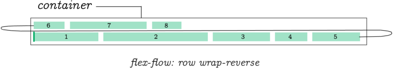
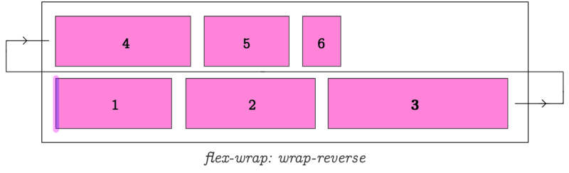
flex-flow:row wrap-reverse;
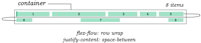
flex-flow:row wrap; justify-content: space-between;
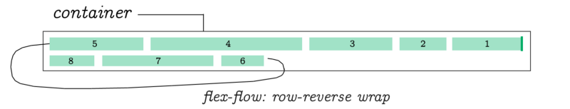
flex-flow:row-reverse wrap;
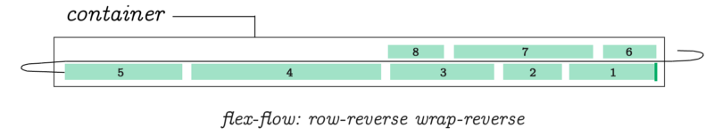
flex-flow:row-reverse wrap-reverse;
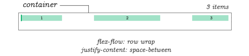
flex-flow:row wrap; justify-content: space-between;
The direction can be changed to make the Cross-Axis primary.
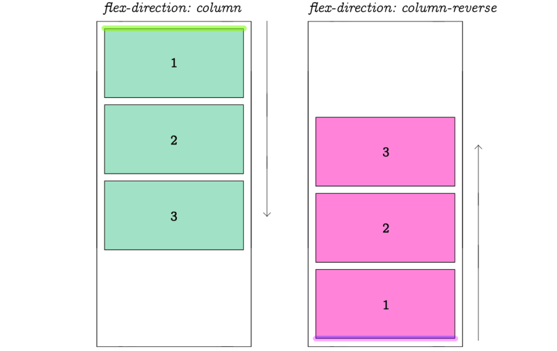
When we change flex direction to column, the flex-flow property behaves in exactly the same way as in previous examples. Except this time, they follow the vertical direction of a column.
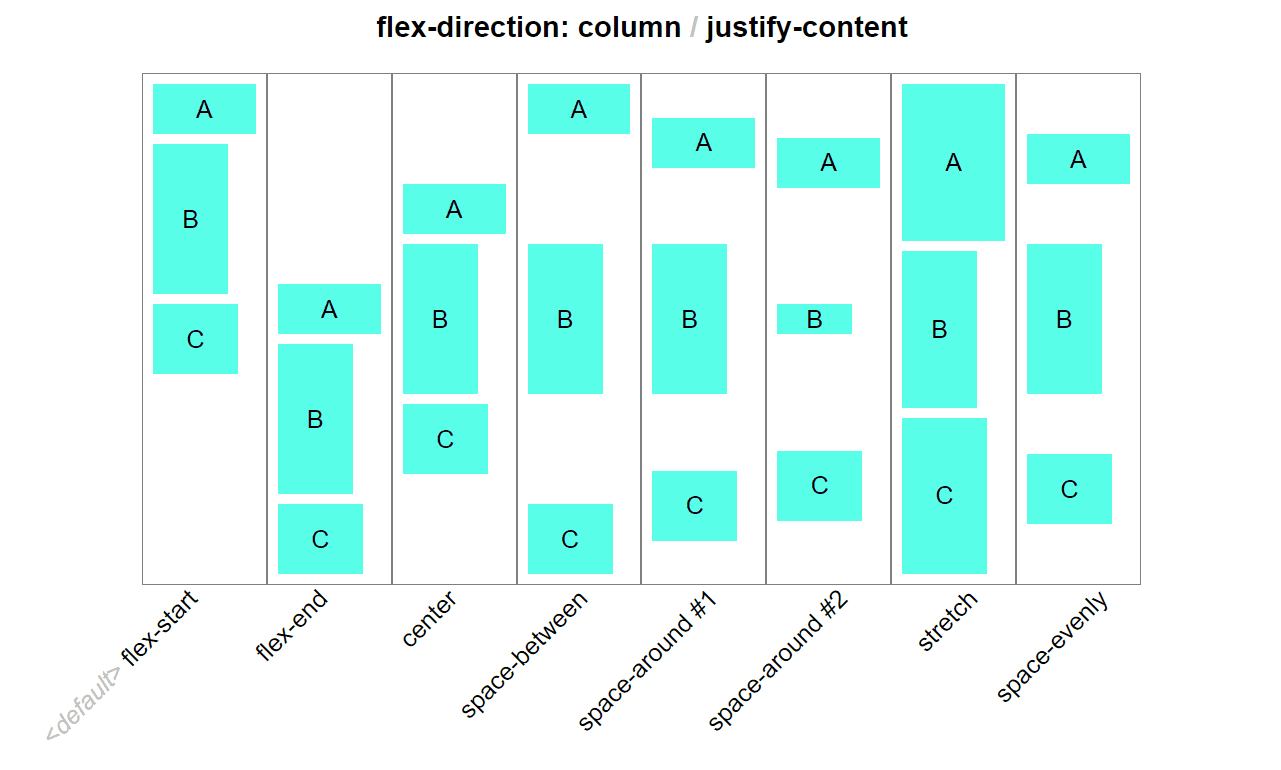
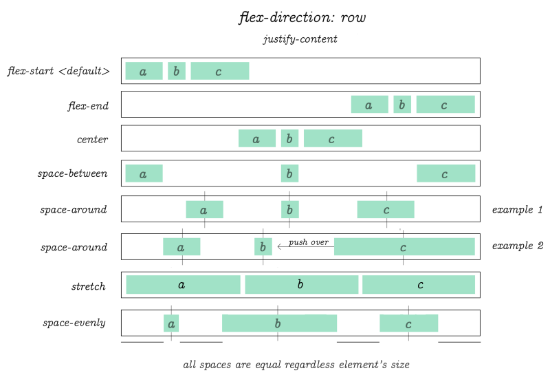
justify-content
I received a lot of requests to clarify the example above. So I created this animation. The original piece from which the diagram was crafted:
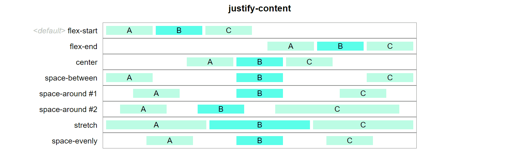
Animated justify-content.
Hope this CSS flex animation clears some of the use case fog!
flex-direction:row; justify-content: flex-start | flex-end | center | space-between | space-around | stretch | space-evenly. In this example we're using only 3 items per row.
There is no limit on the number of items you wish to use in flex. These diagrams only demonstrate the behavior of items when one of the listed values is applied to justify-content property.
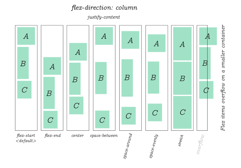
The same justify-content property is used to align items when flex-direction is column.
css-flex-animation-direction-column-justify-content-all-use-case-examples.gif
Packing Flex Lines (according to Flex specification)
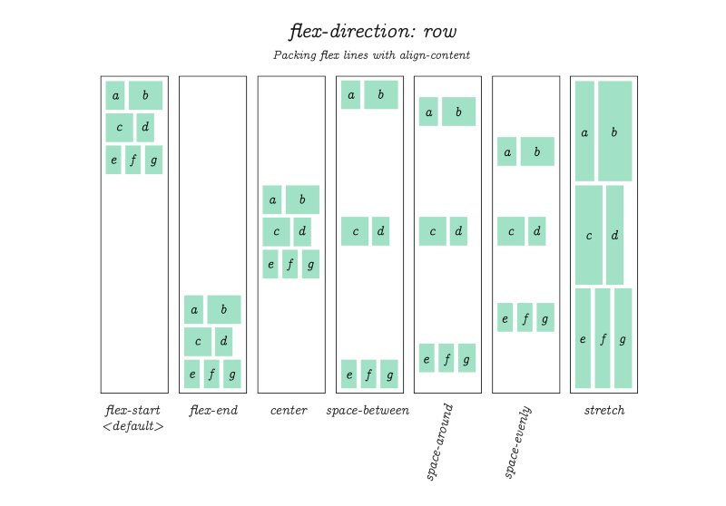
I'm not sure if this is actually implemented in any browser, but at one time it was part of CSS flex specification and probably at least worth mentioning just to be complete.
Flex specification refers to this as "packing flex lines." Basically, it works just like the examples we've seen on the previous few pages. Except this time, note that the spacing is between whole sets of items. This is useful when you want to crate gaps around a batch of several items.
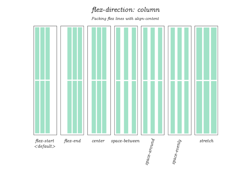
Packing Flex Lines (continued.) But now with flex-direction set to column.
align-items
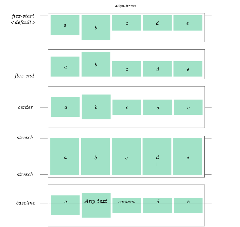
align-items controls the align of items horizontally, relative to the parent container.
flex-basis

flex-basis works similar to another CSS property: min-width outside of flex. It will expand item's size based on inner content. If not, the default basis value will be used.
flex-grow
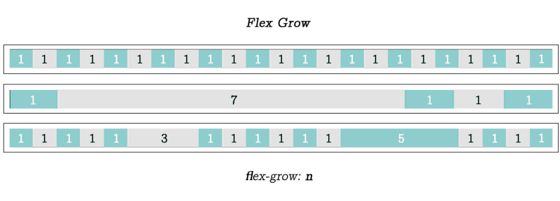
flex-grow, when applied to an item will scale it relative to the sum of the size of all other items on the same row, which are automatically adjusted according the the value that was specified. In each example here the item's flex-grow value was set to 1, 7 and (3 and 5) in the last example.
flex-shrink
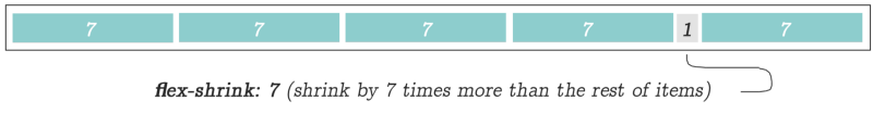
flex-shrink is the opposite of flex-grow. In this example value of 7 was used to "shrink" the selected item in the amount of time equal to 1/7th times the size of its surrounding items - which it will be also automatically adjusted.
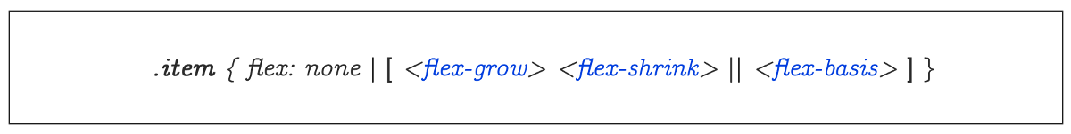
When dealing with individual items, you can use the property flex as a shortcut for flex-grow, flex-shrink and flex-basis using only one property name.
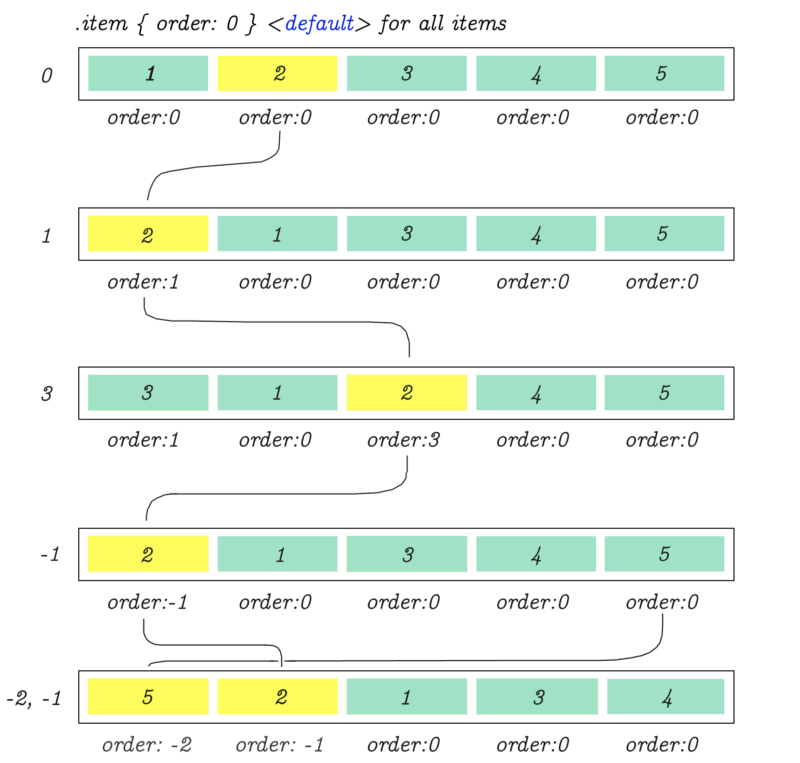
order
Using order property it's possible to re-arrange the natural order of items.
justify-items
One last thing for those who are looking to use CSS Grid together with Flex Box… CSS grid's justify-items is similar to Flex's justify-content. (The properties described in the above diagram will not work in Flex, but it's pretty much the grid's equivalent for aligning cell content.)
Get CSS Visual Dictionary (Recommended in PDF format, because it's in color)
(my coding book)
Hey guys, making tutorials like this one can take weeks (and months of follow up improvements) of work. Just the diagrams alone were done over the course of two weeks working every day! With suggestions from others the text is improved and edited over a month or longer.
You can support my work to help me continue making more web development tutorials.
CSS Visual Dictionary (PDF download) was the book the diagrams in this tutorial were taken from - this book is a complete classic! featuring a visual diagram for every CSS property in existence much like what you've seen in this tutorial except for everything.
Over the years the book earned ⭐ 4.5 stars rating from coding community for its dense content and complete coverage. There is a diagram on every page.
If you want to own this book grab a copy of CSS Visual Dictionary (PDF download) (It's an instant PDF download after purchase.)
CSS Visual Dictionary is also available on Amazon in paperback format if you want a physical copy.
Learn CSS Visually! Every single CSS property visualized in this pictorial CSS guide book!
⭐⭐⭐⭐ and 1/2⭐ - owned by over 27.1K readers.
Get this CSS book in PDF format, on Amazon or start reading this css book on your Kindle device today!
Articles Related To Css Community
- How To Add Vertical Ellipsis After Multiple Lines Of Text In CSS on 11 Aug 2023 by Ghost Together
- Interactive CSS Flex Tutorial / Flexible Box on 6 May 2021 by Ghost Together
- Do This If Text-Overflow Ellipsis Is Not Working on 1 Feb 2021 by Ghost Together
Last 10 Articles Written On Ghost Together
- The dead audience dilemma on 16 Jul 2025 by ディーン・タリサイ
- xv on 24 Jun 2024 by AndrewOcean
- How to get started on 17 Dec 2023 by Kenya
- How To Make Characters In Midjourney on 14 Dec 2023 by Ghost Together
- How to make money online on 12 Dec 2023 by DRSMS313
- How To Make Consistent Characters In Midjourney on 12 Dec 2023 by Ghost Together
- Wildfires and Wastelands on 10 Dec 2023 by A. Stranger
- How To Download, Install And Activate Davinci Resolve Studio 18 on 10 Dec 2023 by Ghost Together
- How to use LUTs in Davinci Resolve 18 on 10 Dec 2023 by Ghost Together
- Write about Association between surface of the polyp with histomorphology Polypoi... on 10 Dec 2023 by msjrez
Last 10 Css Questions Asked On Ghost Overflow
- How to add vertical ellipsis on 2nd or 3rd text line with display webkit box and ... Published date unknown by Ghost Together
Other Websites In Our Content Network
Voxel Engine Tutorials | Jeep Windshield Decals | loom craft | etsy alternative | craigslist alternative | instagram alternative | discord alternative | reddit alternative | x alternative