How To Center 3 Mona Lisa Images In DIV Element
You can align 3 or more images in the middle of a div element using CSS flex model
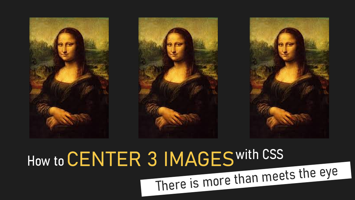
How to center 3 images or elements inside a div using CSS Flex
In this tutorial we'll take a look at how to setup 3 images centered inside parent div container.
The best way to center three images in a div element is by using flex layout model.
You've tried doing it with flex but centering images still doesn't work and images don't align.
That's because there is a catch. You need to wrap each of your img tags with div inside flex container.
Here is CSS code example for centering 3 images, for the parent DIV container they're in:
#parent {
  display: flex;
  flex-direction: row;
  justify-content: center;
}
Apply this to parent element.
Then inside the parent, drop your 3 images, or any HTML elements:
  <div id = "parent">
    <div>
      <img src = "mona-lisa.png">
    </div>
    <div>
      <img src = "mona-lisa.png">
    </div>
    <div>
      <img src = "mona-lisa.png">
    </div>
  </div>
Don't forget to wrap your image tag in a div
An image is an inline element by default, so they're hard to center, but once it's placed inside display:flex container, it becomes a flex "item" that can be easily spaced and centered horizontally.
How to increase or decrease space between images witout margin or padding?
Spacing 3 images using flex is the best way, because you can also specify amount of space you want to have between images, without adding margin or padding to the images.
If you think in the first example images are too close together, you can set the amount of space between images by setting justify-content property to another value.
Spacing between 3 images can also be controlled (see below).
Note that 3 images stretch equally across entire width of this page, responsively, regardless what device you're viewing it on. The amount of space between images can also be controlled using Flex, a CSS layout model for quickly aligning inner items, not just images!
Use justify-content property to determine space style between images:
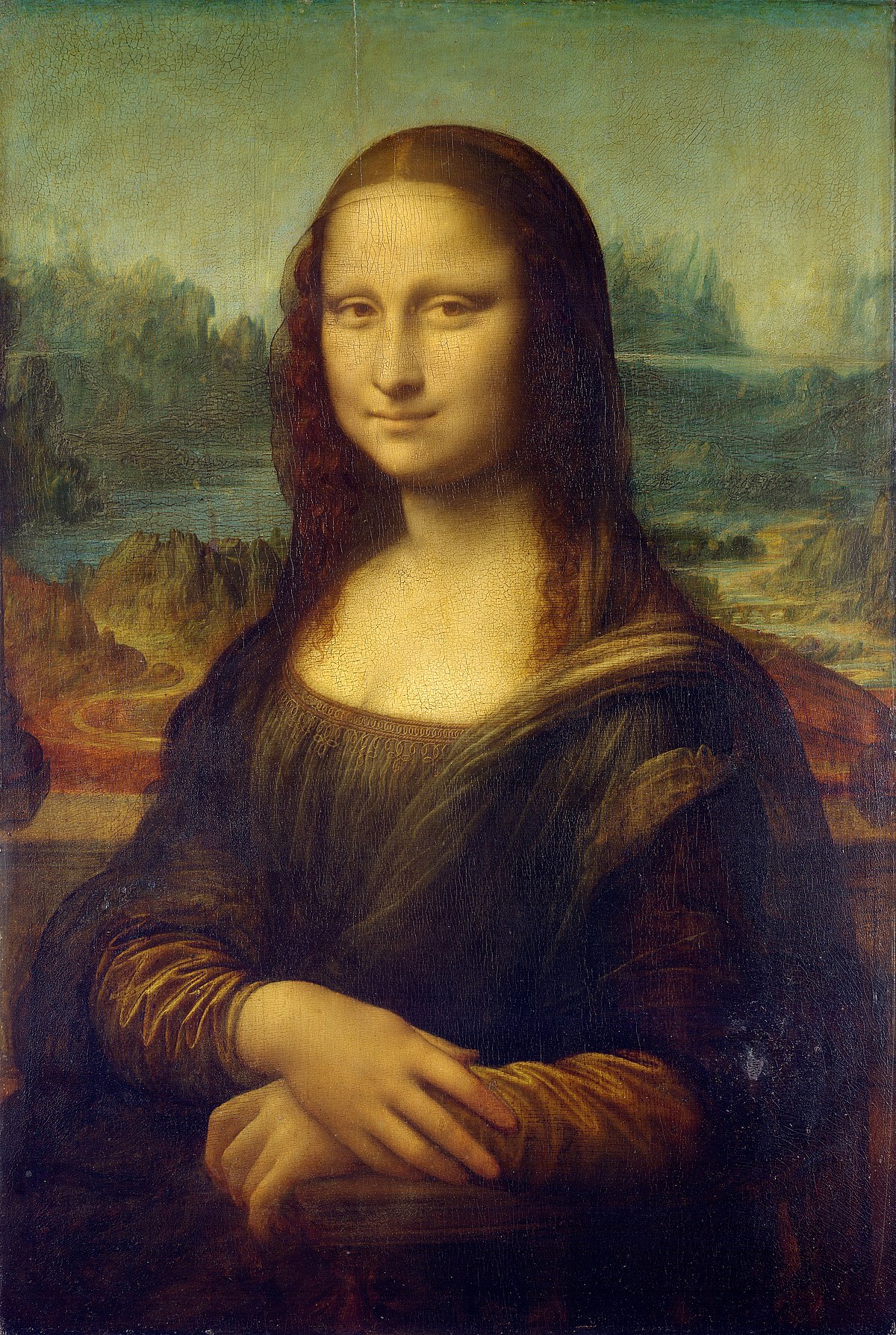


justify-content: center


justify-content: space-between


justify-content: space-around
Note: Make sure to set your parent container's width to 100% or a static value.
There are 7 styles total.
Click this link to see >>> all justify-content examples here.
How to center 3 images horizontally?
Here is what you need to do:
- Set the display property to flex.
- Set flex-direction property to either row (default) or column
- Set the justify-content property to center to center on horizontal axis.
- Set the align-items property to center to center on vertical axis
This wil center 3 images proportionately in the middle of your div element.
How to center images vertically
To center 3 images within parent container vertically:
- Change flex-direction to column,
If you need 3 images to be centered only vertically or only horizontally, simply change flex-direction between row and column.


Changing flex-direction to column flips the axis, centering still occurs on the same axis as in previous example.
This is why you don't even need to change the value of justify-content property.
#parent {
  display: flex;
  flex-direction: column;
  justify-content: center;
}
(Note, for best practice, move your inline CSS out of style attribute, and place it between two style tags, or into an external CSS file.)
Horizontal axis (left/right): The justify-content property is applied to the div, and the center value is used to align the flex items horizontally in the center of the container.
Main axis (down/up): The align-items property is also applied to the div, and the center value is used to align the flex items vertically in the center of the container.
This will center the three images within the div element using CSS flex model.
Explanation for why centering 3 images works using this setup
The display property specifies the type of layout model that an element should use, and the flex value indicates that the element should use the Flexbox layout model.
The justify-content property specifies the horizontal alignment of flex items within a flex container, and the center value aligns the flex items in the center of the container.
The align-items property specifies the vertical alignment of flex items within a flex container, and the center value aligns the flex items in the center of the container.

