
Star or fork ps5.js 35.9 KB @ this GitHub
I tweeted the PS3 demo here when I created basic version of PS3 UI in JavaScript. I don't have the code for it (yet.) But I plan on publishing it. Moreover, this tutorial is built on what I learned from that first work.
The Initial Setup
To make things simple, no frameworks were used.
But even if you use frameworks or libraries, you still need to develop your problem solving pattern. This UI tutorial exposes the thinking behind the process. It can be easily adapted to React, Vue or Angular.
I used this starter HTML file with some pre-made flex styles. It contains all the basics and general app structure to get started. It's not React or Vue, but it's the minimum setup needed to start building on top of. I use it every time I need to start a new vanilla app or site.
HTML and CSS
Some of the basics from HTML starter file will be explained here.
Simple Home Brew CSS Framework
I'm not a huge fan of CSS frameworks and prefer the pure approach. However, after thousands of hours coding, you start to see patterns that repeat the most. Why not create a few simple classes to cover most common cases? We'll avoid typing and retyping the same property names and values hundreds of times.
.rel { position: relative }
.abs { position: absolute }

.top { top: 0 }
.left { left: 0 }
.right { right: 0 }
.bottom { bottom: 0 }

/ flex /
.f { display: flex; }
.v { align-items: center }
.vs { align-items: flex-start }
.ve { align-items: flex-end }
.h { justify-content: center }
.hs { justify-content: flex-start }
.he { justify-content: flex-end }
.r { flex-direction: row }
.rr { flex-direction: row-reverse }
.c { flex-direction: column }
.cr { flex-direction: column-reverse }
.s { justify-content: space-around }

.zero-padding { padding: 0 }

.o { padding: 5px }
.p { padding: 10px }
.pp { padding: 20px }
.ppp { padding: 30px }
.pppp { padding: 50px }
.ppppp { padding: 100px }

.m { margin: 5px }
.mm { margin: 10px }
.mmm { margin: 20px }
.mmmm { margin: 30px }
These CSS classes are self-explanatory.
Our first custom CSS styles
Now that we have basic CSS defined, let's add some styles that modify appearance of hidden and shown menu containers. Remember, because we have multiple menus and can switch between them, we need a way to indicate which menus are currently "on" and which are turned "off".
By multiple menus, I mean each menu will have its own screen, defined by a separate HTML element. Switching to a next menu will hide previous container and display the new one. CSS transitions modifying opacity, position and scale might also play during this process to create smooth UX transitions.
All containers with .menu class will be in "off" state by default (hidden from view.) Any element with classes .menu and .current will be considered in "on" state and be visible on the screen.
Other items such as selectable buttons within the menus themselves will also use .current class but in a different CSS hierarchy context. We'll explore their CSS styles further down in this tutorial.
#ps5 {
   width: 1065px;
   height: 600px;
   background: url('https://semicolon.dev/static/playstation_5_teaser_v2.jpg');
   background-size: cover;
}

/ default menu container - can be any UI screen /
#ps5 section.menu {
    display: none;
    opacity: 0;

    // gives us automatic transitions between opacities
    // which will create fade in/fade out effect.
    // without writing any additional JavaScript
    transition: 400ms;
}

#ps5 section.menu.current {
    display: flex;
    opacity: 1;
}
Again section.menu is the default parent container for any of the menu layers we will create. It can be the "games browser" screen or "settings" screen. It's invisible by default until we apply .current class to element's classlist property.
And section.menu.current indicates the currently selected menu. All other menus should be invisible and .current class should never be applied to more than one menu at a time!
The HTML
Our home brew mini CSS framework makes HTML pretty straightforward. Here is the main scaffold:
<body>
    <section id = "ps5" class = "rel">
        <section id = "system" class = "menu f v h"></section>
        <section id = "main" class = "menu f v h"></section>
        <section id = "browser" class = "menu f v h"></section>
        <section id = "settings" class = "menu f v h"></section>
    </section>
</body>
The ps5 element is the main app container.
Most of flex is f v h for centered elements so you'll see this combo often.
You'll also see f r for flex-direction:row; and f c for flex-direction:column;
Subsections are separate menu views that require class menu. We'll be able to switch between them.
In code, they will be enumerated with a frozen object (you'll see this below.)
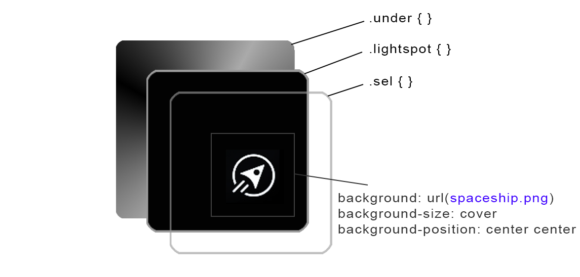
Background Swapper
One of the very first things I wanted to get out of the way was the background changer. If I could get it done first, I could simply integrate it later into all future functions that needed to change the background. To do this I decided to create 2 interchangeable divs.
Whenever a new background becomes active, I simply swap the two divs, change style.background property to the new image URL and applly .fade-in class to the new background, removing it from the previous one.
I started with the following CSS:
#background-1, #background-2 {
    position: absolute;
    top: 0;
    left: 0;
    width: inherit;
    height: inherit;
    background: transparent;
    background-position: center center;
    background-size: cover;
    pointer-events: none;
    transition: 300ms;
    z-index: 0;
    opacity: 0;
    transform: scale(0.9)
}

/ This class will be applied from Background.change() function /
.fade-in { opacity: 1 !important; transform: scale(1.0) !important; z-index: 1 }

/ set first visible background /
#background-2 { background-image: url(https://semicolon.dev/static/playstation_5_teaser_v2.jpg); }
Then I created helper static function .change stemming from Background class that basically swaps the two divs and faded them in and out (It takes one argument - the URL of the next image):
class Background {constructor() {}}

Background.change = url => {

    console.log(Changing background to https://semicolon.dev/tutorial/javascript/ps5-ui-js)

    let currentBackground = $(.currentBackground);
    let nextBackground = $(.nextBackground);

    // set new background to url
    nextBackground.style.backgroundImage = url(https://semicolon.dev/tutorial/javascript/ps5-ui-js)

    // fade in and out
    currentBackground.classList.remove('fade-in')
    nextBackground.classList.add('fade-in')

    // swap background identity
    currentBackground.classList.remove('currentBackground')
    currentBackground.classList.add('nextBackground')
    nextBackground.classList.remove('nextBackground')
    nextBackground.classList.add('currentBackground')

}
From now on, every time I needed to show a new background, I would simply call this function with the image of the URL I wanted to show up as follows:
Background.change('https://semicolon.dev/static/background-1.png')Fade ins will be taken care automatically because transform: 300ms is already applied to each background and the .fade-in class will take care of the rest.
Building Main Navigation Menu
Now that we have our basic scaffold ready, we can start building out the rest of the UI. But we'll also need to create a class to manage our UI. We'll call this class PS5Menu. How to use it will also be explained below.
The System Screen
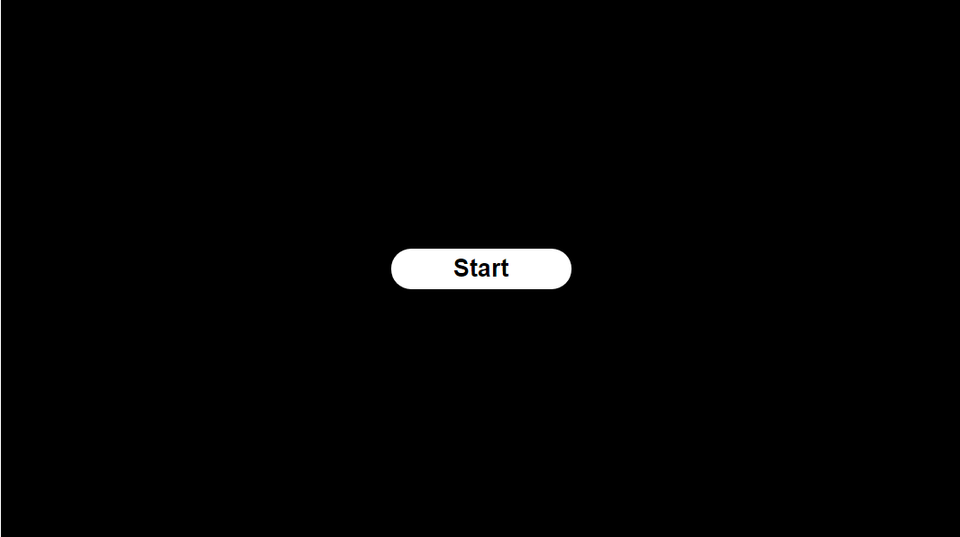
Simple CSS was used to create the Start button. Once user clicks, we enter the main PS5 menu. We'll place this Start button into our first menu on the screen - the system menu:
<section id = "system" class = "menu f v h">
    <div id = "start" class = "f v h">Start</div>
</section>
Likewise, content for all other menus will be placed within their respective parent container elements.
We'll get there later in this tutorial. First, we need to think about how to organize multiple menu screens.
At this point we need to know about the concept of queuing multiple menus. PS5 has several layers of different navigation UIs. When choosing Settings, for example, a new, completely different menu opens up and keyboard controls are transferred to that new menu.
We need something to keep track of all these menus constantly opening up, being cancelled and then being replaced by a new or a previous menu again.
You can use JavaScript Array's built-in push method to add new menu to the queue. And when you need to go back you can call Array's pop method to go back to whatever the previous menu was.
We will enumerate menus by element's id attribute:
const MENU = Object.freeze({
    system: system,
      main: main,
   browser: browser,
  settings: settings,

/ add more if needed/

});
I used Object.freeze() to make sure none of the properties can be changed once they are set. Some types of objects are best frozen. They are the ones you 100% know shouldn't change during lifetime of your application.
Here each value is property name in string format. This way we can refer to menus' elements by MENU.system or MENU.settings from now on. This is nothing more than syntactic aesthetics, if not a simple way to keep all menu objects in the same basket, so to speak.
The PS5Menu class
To start out, I created PS5Menu class. Its constructor harbors a this.queue property of type Array.
// menu queue object for layered PS5 navigation
class PS5Menu {

    constructor() {
        this.queue = []
    }

    set push(elementId) {
        // hide previous menu on the queue by removing "current" class
        this.queue.length > 0 && this.queue[this.queue.length - 1].classList.remove(current)

        // get menu container
        const menu = $(#${elementId})

        // make the new menu appear by applying "current" class
        !menu.classList.contains(current) && menu.classList.add(current)

        // push this element onto the menu queue
        this.queue.push( menu )

        console.log(Pushed #${elementId} onto the menu queue)
    }

    pop() {
        // remove current menu from queue
        const element = this.queue.pop()

        console.log(Removed #${element.getAttribute('id')} from the menu queue)
    }
}
How to use the PS5Menu class?
This class has two methods. The setter push(argument), and static function pop(). They'll do pretty much what array's .push() and .pop methods do on our this.queue array.
For example, to instantiate the menu class and add or remove menu to its stack, we can call push and pop methods directly from the instance of the class.
// instantiate the menu object from class
const menu = new PS5Menu()
// add menu to the stack
menu.push = system
// remove the last menu that was pushed onto the stack from it
menu.pop()
Class setter functions like set push() cannot be called with (). They are assigned a value with = value assignment operator. The class setter function set push() will then execute with that parameter.
Let's put together everything we have so far:
/ Your DOM just loaded /
window.addEventListener('DOMContentLoaded', event => {
    // Instantiate the queable menu
    const menu = new PS5Menu()

    // Push system menu onto the menu
    menu.push = system

    // Attach click event to Start button
    menu.queue[0].addEventListener(click, event => {

        console.log(Start button pressed!)

        // begin the ps5 demo!
        menu.push = main
    });

});
Here we instantiated our PS5Menu class and stored its object instance in menu variable.
Then we pushed our first menu with id #system onto our multiple menu queue.
We then attached click event to the Start button. When user will press it, we push the main menu (whose id is main) to be our current menu. This will hide the system menu (the menu currently in our menu queue,) and will show the #menu container.
Note, because our menu container class .menu.current has transform: 400ms; property, simply adding or removing .current class from the element newly added or removed properties will be animated in 0.4 milliseconds.
Now we need to think about how to create content for the main menu.
Note this step is taken in DOM's "Content Loaded" event DOMContentLoaded. This should be the entry point to any UI-based app. The second entry point is window.onload but we don't need it in this demo. It's for waiting when media (images, etc.) is finished downloading, which can take place much later after DOM elements are available.
The Intro Screen
The main UI starts out as a row of several elements. The entire row emerges from the right side of the screen. It is animated left, as the row shows up for the first time.
I embedded these items into #main container as follows:
<section id = "main" class = "menu f v h">
    <section id = "tab" class = "f">
        <div class = "on">Games</div>
        <div>Media</div>
    </section>
    <section id = "primary" class = "f">
        <div class = "sel t"></div>
        <div class = "sel b current"></div>
        <div class = "sel a"></div>
        <div class = "sel s"></div>
        <div class = "sel d"></div>
        <div class = "sel e"></div>
        <div class = "sel"></div>
        <div class = "sel"></div>
        <div class = "sel"></div>
        <div class = "sel"></div>
        <div class = "sel"></div>
    </section>
</section>
The first PS5 menu is placed within parent container whose style is defined as follows:
#primary {
    position: absolute;
    top: 72px;
    left: 1200px;
    width: 1000px;
    height: 64px;
    opacity: 0;

    / animate at the rate of 0.4s /
    transition: 400ms;
}

#primary.hidden {
    left: 1200px;
}
By default, in its "hidden" state #primary is intentionally not shown, and moved far enough right by 1200px.
You just have to use trial and error and some of your intuition. A value of 1200px seemed to work well. This container also inherits opacity:0 from .menu class.
So when #primary appears for the first time it looks like it's sliding and fading in at the same time.
The value transform:400ms; (same as 0.4s) was used here again, because most micro animations look good at 0.4s, for some reason. 0.3s is still good, but might be too fast and 0.5s too slow.
Using CSS Transitions To Control UI Animations
Instead of manipulating CSS styles manually every time we need to change the style or position of a UI block, we can simply assign and remove classes:
// get element:
const element = $(#primary)
// check if element already contains a CSS class:
element.style.classList.contains("menu")
// add a new class to element's class list:
element.style.classList.add("menu")
// remove a class from element's class list:
element.style.classList.remove("menu")
This is an important strategy that will save a lot of time and keep your code cleaner in any vanilla project. Instead of changing property style.left we will simply remove .hidden class from #primary element. Because it has transform:400ms; the animation will play automatically.
We'll use this tactic to change pretty much every state of any UI element.
Secondary Slide Out Animation
There are different types of animation when dealing with UX design. Some animations are triggered by switching to a new menu. They usually start after a short span of time, soon after switching to a new screen.
There are also on cursor hover animations that are triggered by mouse or controler when selecting a new adjacent item on the current navigation menu, for example.
Attention to detail is important. Especially when you're looking to build a high-quality product.
Using setTimeout Function To Manage Animation States
Once the items slide out a secondary subtle animation plays. JavaScript's setTimeout function was used to imitate this two-fold effect, soon as DOM tree is fully loaded.
Because this is the first menu screen that appears soon as user clicks Start button, we now need to to update our Start button's click event in our DOMContentLoaded event right after menu.push = main.
The following code will go to the bottom of our already-existing DOMContentLoaded (see source code example above for initial setup) event function:
/ Your DOM just loaded /
window.addEventListener('DOMContentLoaded', event => {
    / Initial setup code goes here...see previous source code example /

    // Attach click event to Start button
    menu.queue[0].addEventListener(click, event => {

        console.log(Start button pressed!)

        // begin the ps5 demo!
        menu.push = main

        // new code: animate the main UI screen for the first time
        // animate #primary UI block within #main container
        primary.classList.remove(hidden)
        primary.classList.add(current)

        // animate items up
        let T1 = setTimeout(nothing => {

            primary.classList.add('up');

            def.classList.add('current');

            // destroy this timer
            clearInterval(T1)
            T1 = null;

        }, 500)
    });

});
So Far We Have This
All this code we wrote will result in this initial animation: